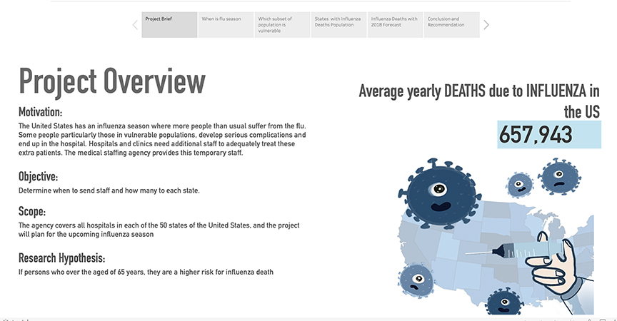
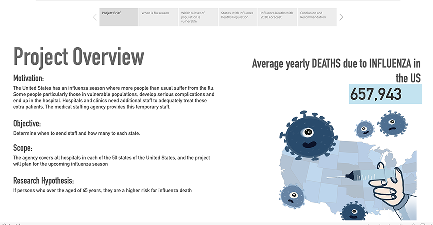
Project Overview
- Motivation: The United States has an influenza season where more people than usual suffer from the flu. Some people, particularly those in vulnerable populations, develop serious complications and end up in the hospital. Hospitals and clinics need additional staff to adequately treat these extra patients. The medical staffing agency provides this temporary staff.
- Objective: Determine when to send staff, and how many, to each state.
- Scope: The agency covers all hospitals in each of the 50 states of the United States, and the project will plan for the upcoming influenza season
Research Hypothesis
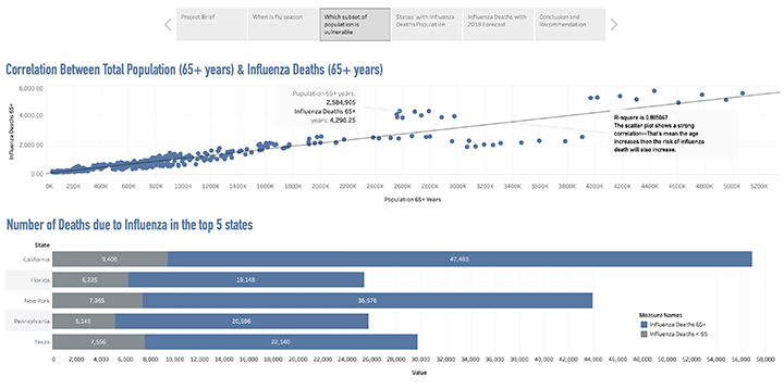
- If persons who over the aged of 65 years, they are a higher risk for influenza death
Data Sets
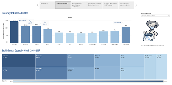
- CDC Influenza Deaths: The data contains monthly death counts for influenza-related deaths in the United Statesfrom 2009 to 2017. Counts are broken into two categories: state and age groups.
- Census Population: The data contains the US population by gender and age, recorded for the different states in the period from 2009 to 2017.
Data Quality
- CDC Influenza Deaths
Found missing values or null values in Death column. it makes 82% of the data and this might make us lose a significant amount of data. I chose to replace null with a random number between 0-9.
- Census Population
It appears that several countries are missing data for certain years but they are just 11% of the total data set so it is advisable. I chose “do notthing”. I removed 3278 duplicated values and removed. 25707 unique values were kept.
Data Limitations
Since the data is input manually, there could always be errors in the numbers. Both datasets are survey data—there are rooms for bias. Also the data time ranges are not long enough to make an accurate prediction
Since the data is input manually, there could always be errors in the numbers. The time range of data collected from 2009 to 2017 which is not enough to make an accurate prediction. When I made a pivot table, I saw that the data has not been consistently collected every year in each county.
Descriptive Analysis
| US Census Data, > 65 years old | Influenza Deaths Data, > 65 years old |
Mean | 806,989 | 889 |
Standard Deviation | 887,017 | 976 |
At an average (Mean), there were 889 flu deaths with an average of 806, 989 at-risk individuals in each state every year. At the standard deviation denotes how much the values may vary from the average. The results are summarized in table above.
| | US Census Data, > 65 years old | Influenza Deaths Data, > 65 years old |
Proposed Relationship: | It’s Positive relationship. if the person is older than 65 years, then the risk for influenza death is higher. |
Correlation Coefficient | 0.9 |
Strength of Correlation | It is a strong correlation. The age increases then the risk of influenza death will also increase |
According to our hypothesis, mortality rate increases or is higher with increased age. The correlation study suggests strong correlation between age and mortality rate. The statistics for the same are summarized in table above.
Results and Insights
| | <65 years | 65 years and above |
Mean | 0.000243721 | 0.001264001 |
Variance | 6.2694E-08 | 2.14633E-07 |
Observations | 458 | 458 |
P(T<=t) one – tail | 2.57E-191 |
Significance Level | 0.05 |
Null Hypothesis | The mortality of people over aged 65 years old is the same or greater than people with under 65 years old. |
Alternative Hypothesis | The mortality of people over aged 65 years old is greater than people with under 65 years old. |
Conclusion | Our p-value is smaller than 0.05, which means the null hypothesis is false so we can reject the null hypothesis. |
Null Hypothesis Rejected? | Yes |
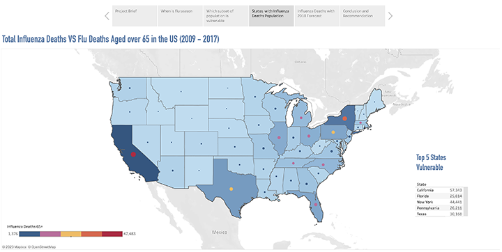
Recommended Next Steps | Next, we can check which states have the highest death rate, then we can send more medical staff to those states. Since we know that a state with higher elderly population are likely to have a higher rate of flu deaths, we should rank each state occurring to elderly population and determine how much staff in need according to population size. |
A two-sample t-test (assuming unequal variances) was conducted between the mortality of people over aged 65 years old and the people with under 65 years old. A significance level of 0.05 was needed to reject the null hypothesis. The results are summarized in table above. As seen in the table, there’s a 95 percent chance that the results are indicate of people who over the aged of 65 years are a higher risk for influenza death.
Next Steps
- Create a visual representation, Map the variables and justify the visualization choice
- Ending the intervention and concluding the analysis